
Browse frequently asked questions about UOA Flow
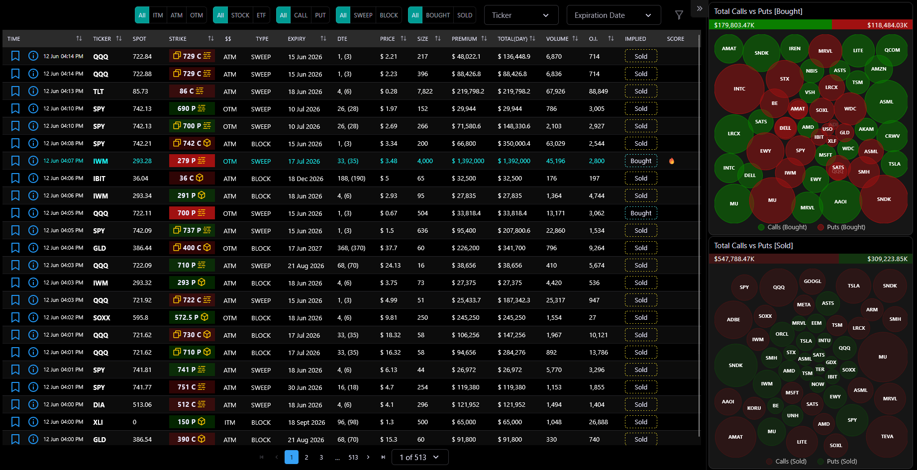
The UOA Flow page is the core feature of JarvisFlow. It provides a real-time, paginated table of Unusual Options Activity — every significant options trade detected across the market.
Each row represents a single options trade and includes the ticker, strike price, expiration date, premium, volume, open interest, and whether it was a sweep or block execution.
Alongside the table, a bubble chart sidebar visualizes the top tickers by premium for both Bought and Sold activity, giving you an at-a-glance view of where smart money is flowing.
The page auto-refreshes every 10 seconds when the server signals new data, and all data is server-paginated — meaning you're always looking at the most current information without reloading the page.
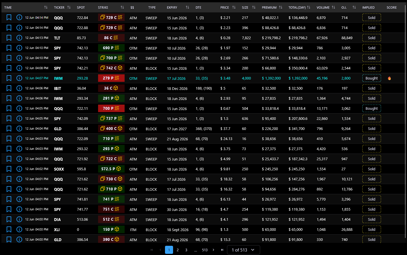
The desktop table displays 15 columns:
Time — When the trade occurred. Click the info icon to open the full detail view.
Ticker — The stock or ETF symbol. Click any ticker to filter the entire table to that symbol. High-activity flows (over $1M today) are highlighted in cyan.
Spot — Current market price of the underlying stock.
Strike — The option's strike price, color-coded by trade type: green (call bought), teal (call sold), red (put bought), yellow (put sold). Also shows sweep/block/repeat icons.
$$ — Moneyness: ITM (In The Money), ATM (At The Money), or OTM (Out of The Money). Click to filter by that moneyness.
Type — Trade execution type: BLOCK, SWEEP, or --- (standard).
Expiry — The option's expiration date. Click to filter by that date.
DTE — Days to Expiration.
Price — The option's last traded price.
Size — Number of contracts traded.
Premium — Total dollar value of the trade (price × size × 100).
Total (day) — Cumulative premium for that ticker on the same day.
Volume — Total contracts traded today.
O.I. — Open Interest (outstanding contracts).
Implied — Direction indicator: Bought (aggressive buyer) or Sold (aggressive seller).
Score — Algorithmic conviction score for the trade.
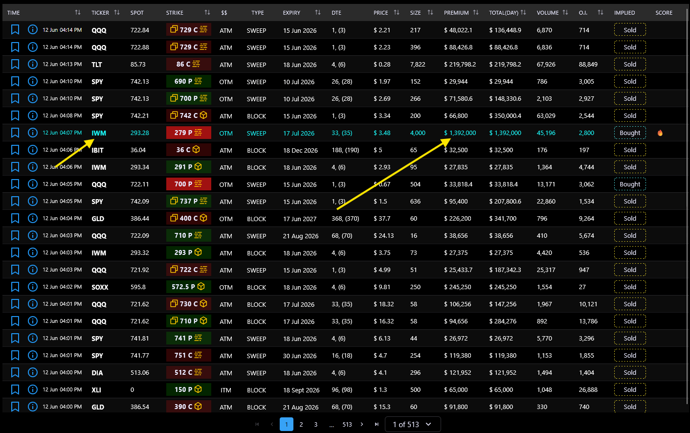
The table uses color and icon conventions to help you quickly identify trade characteristics:
Strike badge colors:
Cell highlight colors:
Trade type icons (next to strike):
Implied direction badge:
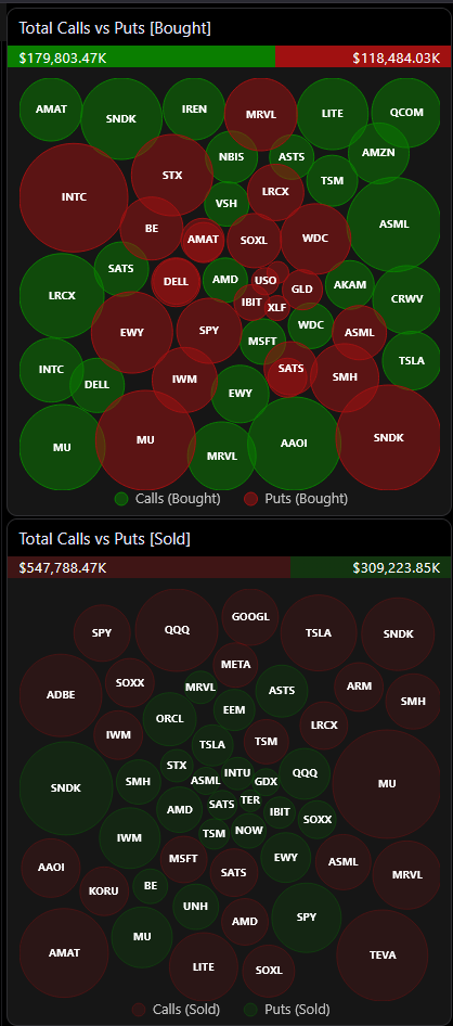
The bubble chart sidebar sits to the right of the flow table (on desktop) and provides two visual summaries:
Top chart: Total Calls vs Puts [Bought]
Bottom chart: Total Calls vs Puts [Sold]
Each bubble represents a ticker and its size is proportional to the total premium traded. Larger bubbles = more money flowing through that ticker's options.
A gradient bar above each chart shows the call/put premium ratio at a glance.
Interactive features:

The Flow page provides a comprehensive set of filters to narrow down the data:
Inline filters (desktop top bar):
Advanced filters (drawer, click the filter icon):
All filters update the table and charts in real time. You can combine as many filters as needed.
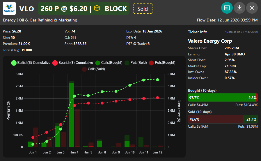
Clicking the info icon on any row opens a FlowInfoCard modal with a comprehensive breakdown of that trade:
Header: Company logo, ticker symbol, strike price, call/put badge, trade type icon, bought/sold indicator, and conviction score.
Metrics grid: Price, Volume, Expiration Date, Size, Open Interest, DTE, Premium, Spot Price, Trade DTE, and Total (Day).
Time-series chart: Shows the last 10 trading days of options activity for that ticker. Toggle between:
Ticker info panel: Company name, Shares Float, Earnings Date, Short Float %, Market Cap, Institutional Ownership %, and Insider Ownership %.
Export: Copy to clipboard or download as PNG image.

The detail modal's time-series chart offers two visualization modes:
Simple mode: Shows two bars per day — Calls and Puts — making it easy to see the raw split of call vs put activity over the last 10 trading days.
Advanced mode: Separates the data into directional flows:
Advanced mode is useful for identifying which side is building a position over multiple days, rather than just seeing raw call/put volume.
Both modes also show a bought/sold indicator bar below the chart, displaying the proportional split for the charted period.
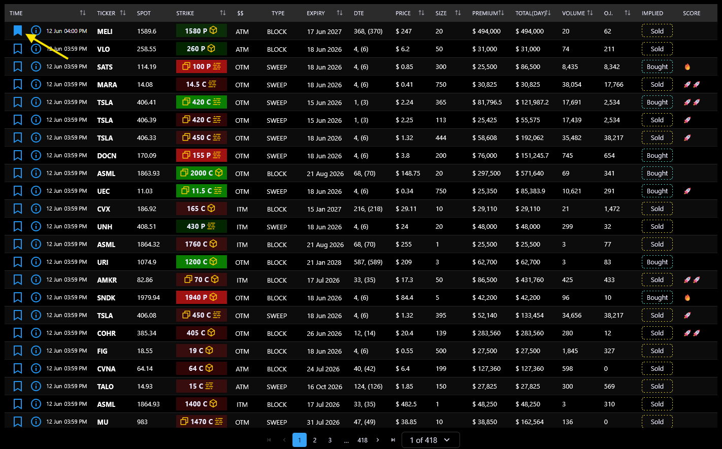
Each row in the flow table has a bookmark icon. Click it to save a flow to your personal collection.
How it works:
Bookmarks are synced to the server and persist across sessions. They're useful for tracking trades you want to revisit, building a watchlist of interesting activity, or marking trades for further analysis in the Chat page.
The Flow page automatically refreshes when the server signals that new data is available.
How it works:
Refresh flag with each response. When true, the client starts auto-refreshing.All refresh requests are silent — no error toasts appear for transient failures. The table and charts update seamlessly when new data arrives.
The page also supports server-side pagination — you can navigate between pages without losing your filter state.
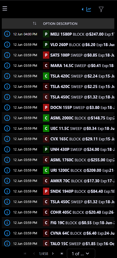
On tablets and phones, the Flow page automatically switches to a compact 3-column layout that's easier to read on narrow screens:
Column 1: Time — Info icon + date (if multi-day range) + time.
Column 2: Option Description — A single rich cell combining: call/put color badge, ticker (clickable to filter), strike price, activity type, price, expiration date, DTE, conviction icon, repeat indicator, and total premium for the day. All key information in one compact cell.
Column 3: Implied — Bought or Sold badge.
You can toggle between Mobile Optimized View and the full desktop layout using the switch in the filter drawer (labeled "Mobile Optimized View"). On smaller screens, the bubble chart sidebar collapses into a drawer accessible from the table header.
The filter controls also adapt — on mobile, all filters live inside the drawer rather than inline.
Join our Discord community or reach out to our support team for personalized assistance