
Get answers to common questions about JarvisFlow's features and functionality
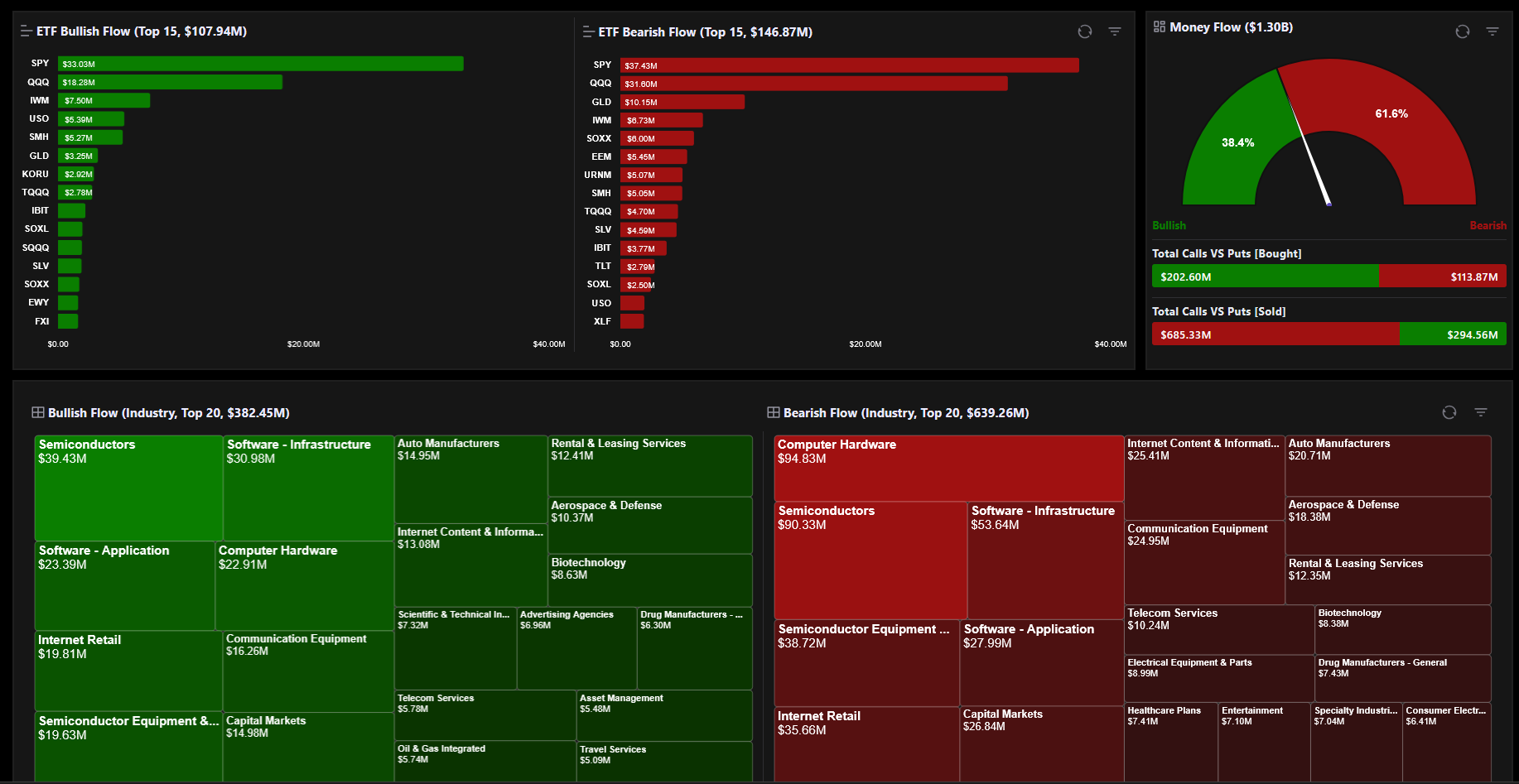
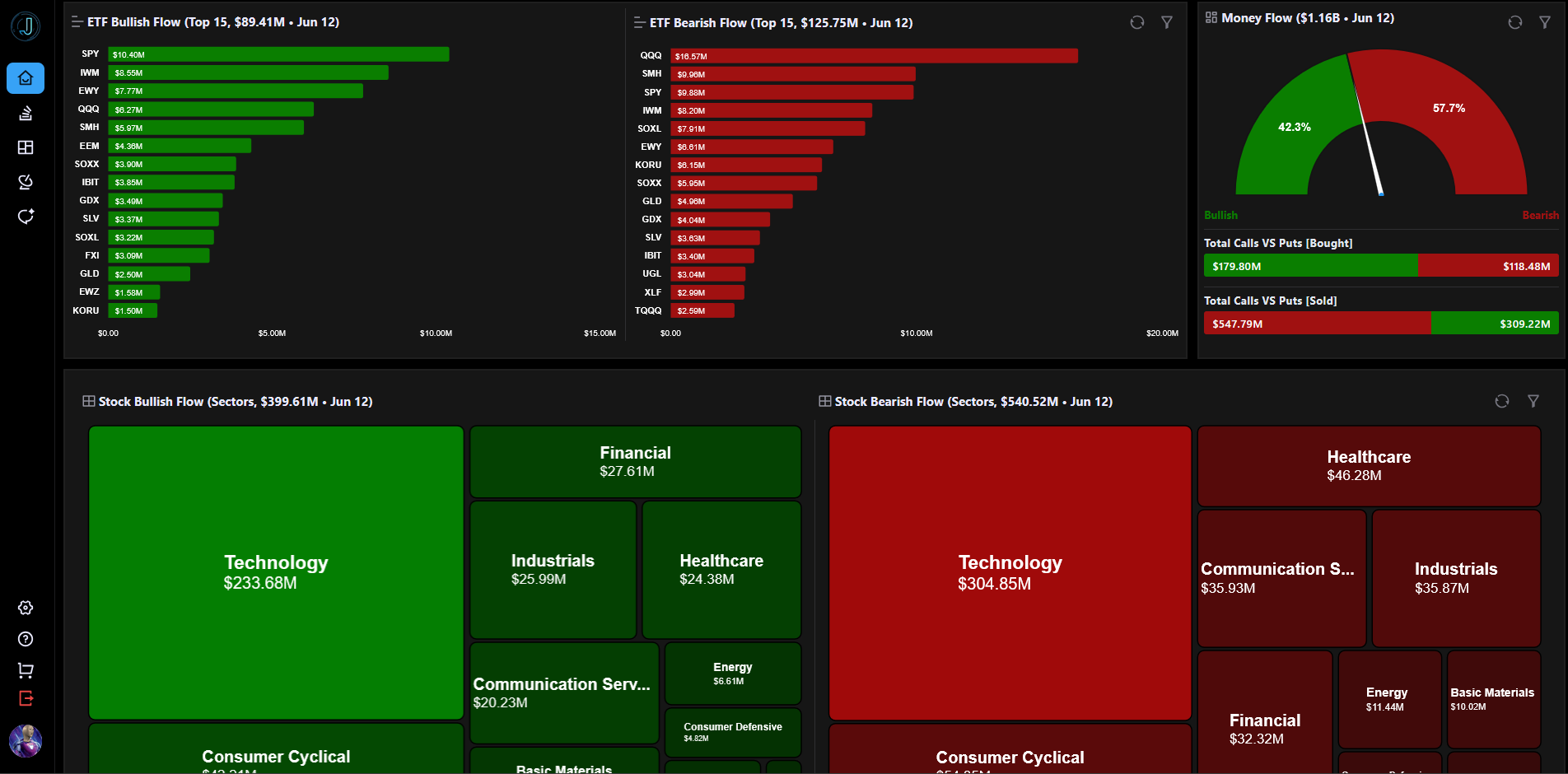
The Dashboard is the landing page of JarvisFlow that provides a high-level overview of market activity across three main sections: ETF Flow Bullish and Bearish Top 15, a Money Flow Gauge chart, and Bullish and Bearish flow on stocks grouped by Industry or Sector. Each section supports date range filtering so you can view historical activity across different time periods.
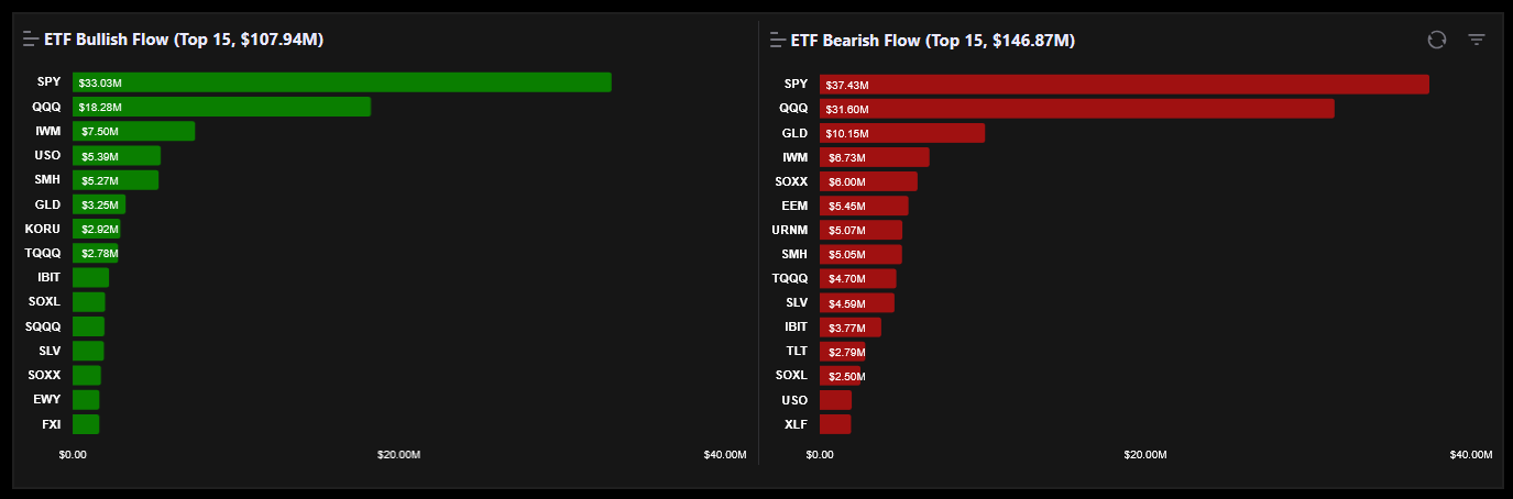
This section displays a ranked list of the top 15 most active ETF options trades split into Bullish (call) and Bearish (put) categories. Each row shows the ticker, total premium, trade count, and whether the activity is bullish or bearish. Use the date range filter above the table to view activity for specific periods.
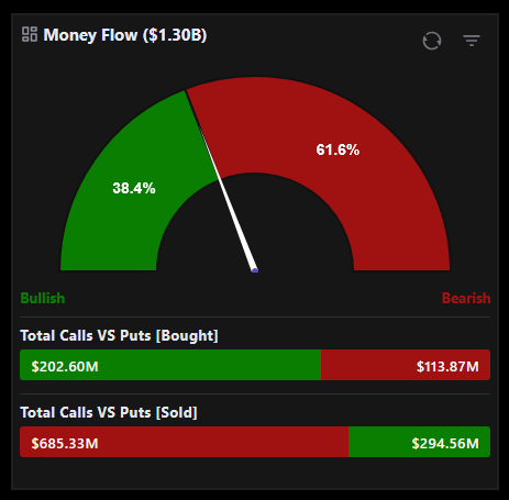
The Money Flow Gauge is a visual chart that displays the direction and magnitude of options money flow for selected assets. It provides two sets of filters: one to choose between Stocks ETFs or All asset types and another to filter by Bought Sold or All flow types. The gauge updates in real time based on your selections.
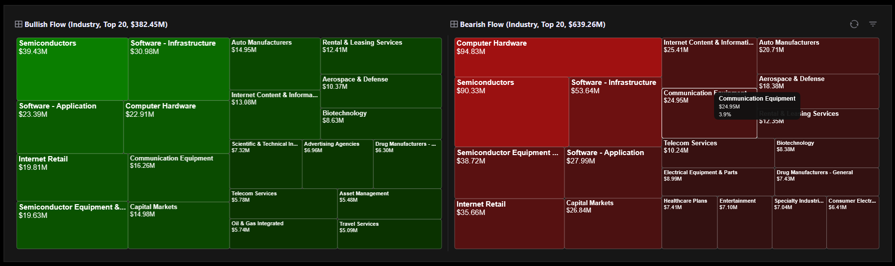
This section shows the top 20 stocks with the highest options flow activity, grouped by either Industry or Sector. You can toggle between grouping by Industry or by Sector. Each group expands to show individual stock tickers within it along with their flow metrics. Use the date range filter to see which industries or sectors have been most active over specific time periods.
Bullish flow refers to options activity that indicates positive or upward directional sentiment. This includes call options bought as well as put options sold. Bearish flow indicates negative or downward directional sentiment and includes put options bought as well as call options sold. On the Dashboard both directions are tracked and displayed separately so you can quickly identify which assets are attracting bullish versus bearish positioning.
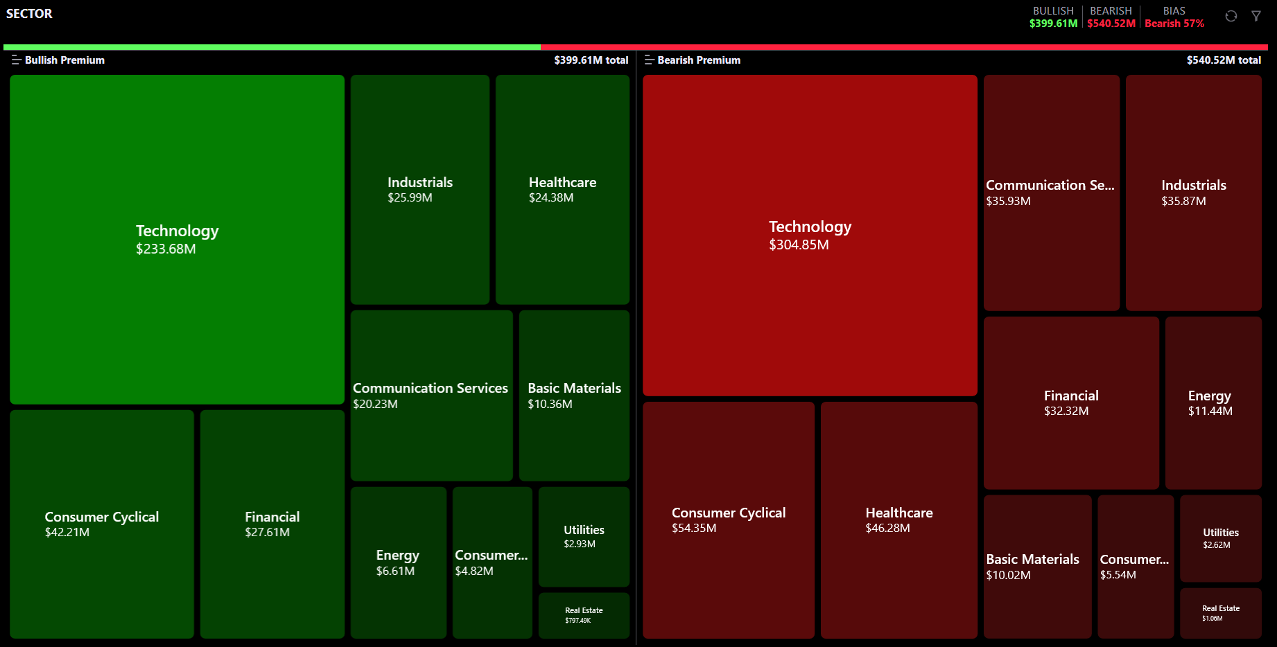
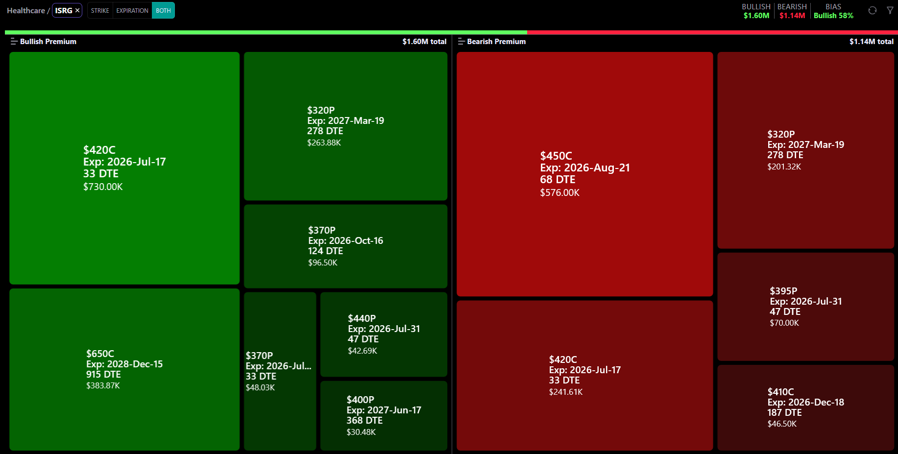
The Heatmap is an advanced visual exploration tool for options money flow on stocks. It uses an interactive treemap where each tile represents a stock (or group of stocks) and its size reflects the total premium traded.
Key differences from the Dashboard:
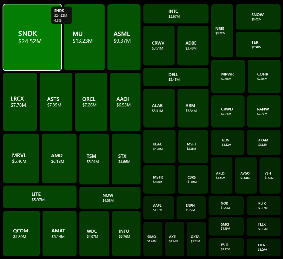
Each tile in the treemap represents a stock, sector, or industry depending on your current drill level.
Tile sizing: Tile area is proportional to the total premium traded. Larger tiles = more options activity.
Tile colors:
Tile labels: Each tile shows its name and the dollar premium amount (e.g., "NVDA $12.5M").
Hover: Hovering over a tile shows a tooltip with the ticker name, premium amount, and its share of the total flow.
Click: Clicking a tile drills down to the next level of detail.
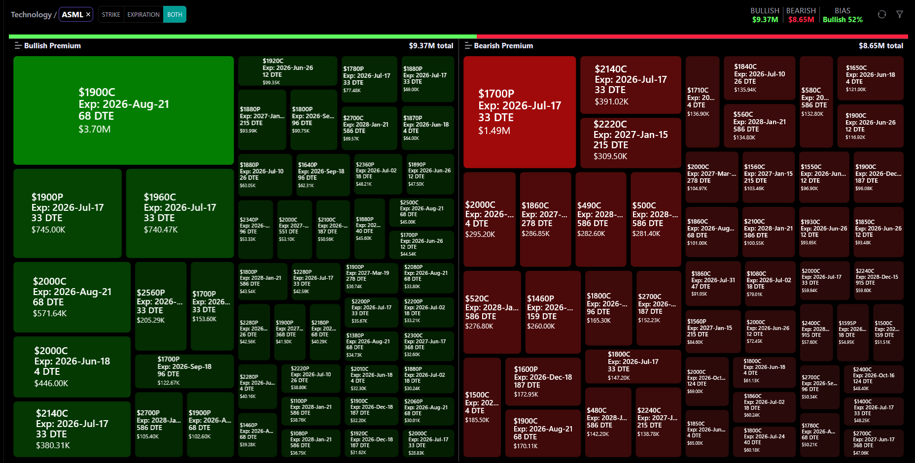
The Heatmap supports 3 levels of drill-down:
Level 1 (Top): All Sectors or All Industries — the top-level treemap tiles.
Level 2: Click a sector or industry tile → the treemap updates to show individual stock tickers within that group.
Level 3: Click a specific ticker → the treemap breaks down that ticker's flow by Strike Price, Expiration Date, or Both.
Navigation: A breadcrumb appears above the treemap showing your current path (e.g., "Sectors > Technology > NVDA"). You can:
You can also use the Sector/Industry/Ticker dropdowns in the filter drawer to jump directly to any level without clicking through.

The top row displays three key metrics:
Bullish Premium — Total dollar amount of bullish options flow (calls bought + puts sold).
Bearish Premium — Total dollar amount of bearish options flow (puts bought + calls sold).
Bias — The dominant sentiment as a percentage. Examples:
Below these stats, a gradient bar visually shows the bullish-vs-bearish split: the green portion represents bullish flow and the red portion represents bearish flow, with dollar amounts on each end.
Use the Sector / Industry toggle at the top of the Heatmap:
Switching the toggle resets the drill-down to the top level and re-fetches data. You can also select a specific sector or industry directly from the filter drawer dropdowns.
The Heatmap supports both Stocks and ETFs. Switch between them using the Instrument Type toggle in the filter drawer (STOCK / ETF).
When in ETF mode:
When switching from ETF back to Stock mode, the drill-down resets to the top level.
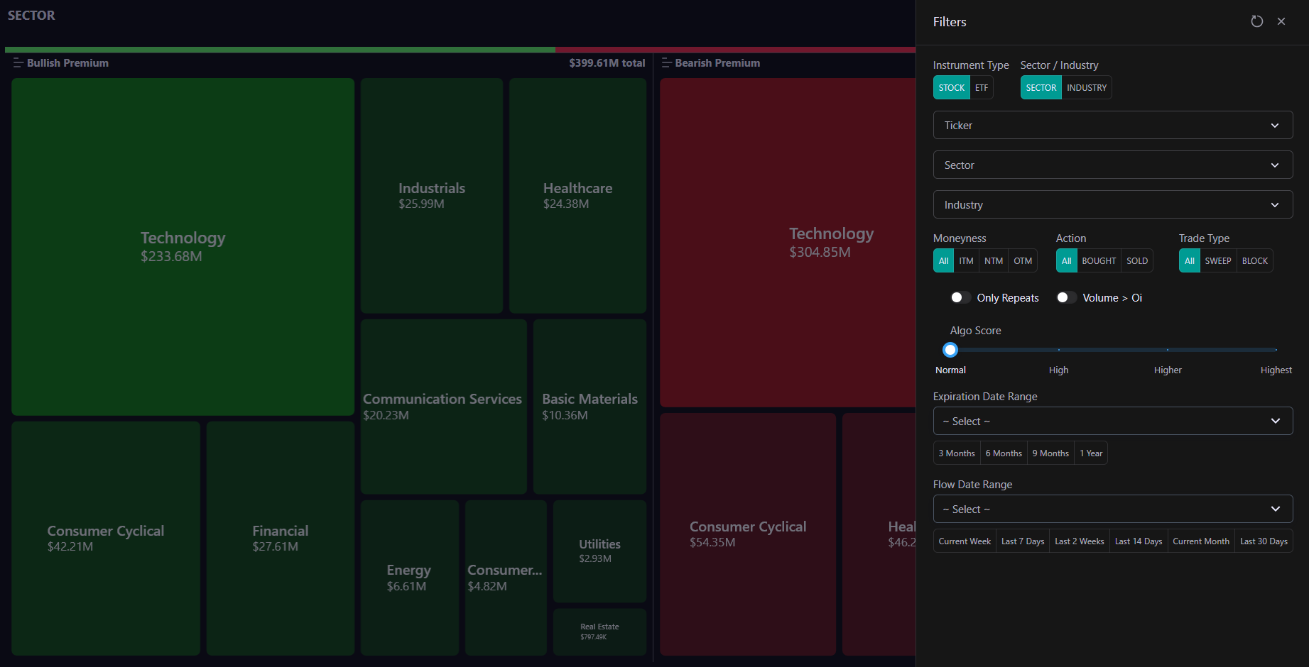
The filter drawer (opened via the filter icon) provides the same power as the Flow page:
Quick Filters (top row):
Dropdown Filters:
Option Filters:
Toggles:
Sliders & Ranges:
Use Reset to clear all filters and return to the default view.
When you drill down to a specific ticker (Level 3), a secondary toggle appears next to the ticker name in the breadcrumb:
The default is Both when you first reach Level 3. Changing this toggle re-fetches the data for the current ticker without leaving the drill-down view.
Tile size reflects the total premium (dollar value) of options flow for that stock or group.
Larger tiles = more money flowing through that stock's options. Smaller tiles = less activity.
Tile sizes are calculated relative to the global total (both bullish + bearish combined), so a tile with $100M premium is visibly larger than one with $25M, regardless of which pane (bullish or bearish) it appears in.
On mobile, fewer tiles are shown (20 instead of 50) to keep them large enough for readable labels.
When you hover over any tile, a tooltip appears showing:
On mobile, tap a tile to see the tooltip briefly before the drill-down action triggers.

The breadcrumb above the treemap shows your current position:
To go back:
You can also use the Sector / Industry / Ticker dropdowns in the filter drawer to jump to any level directly.
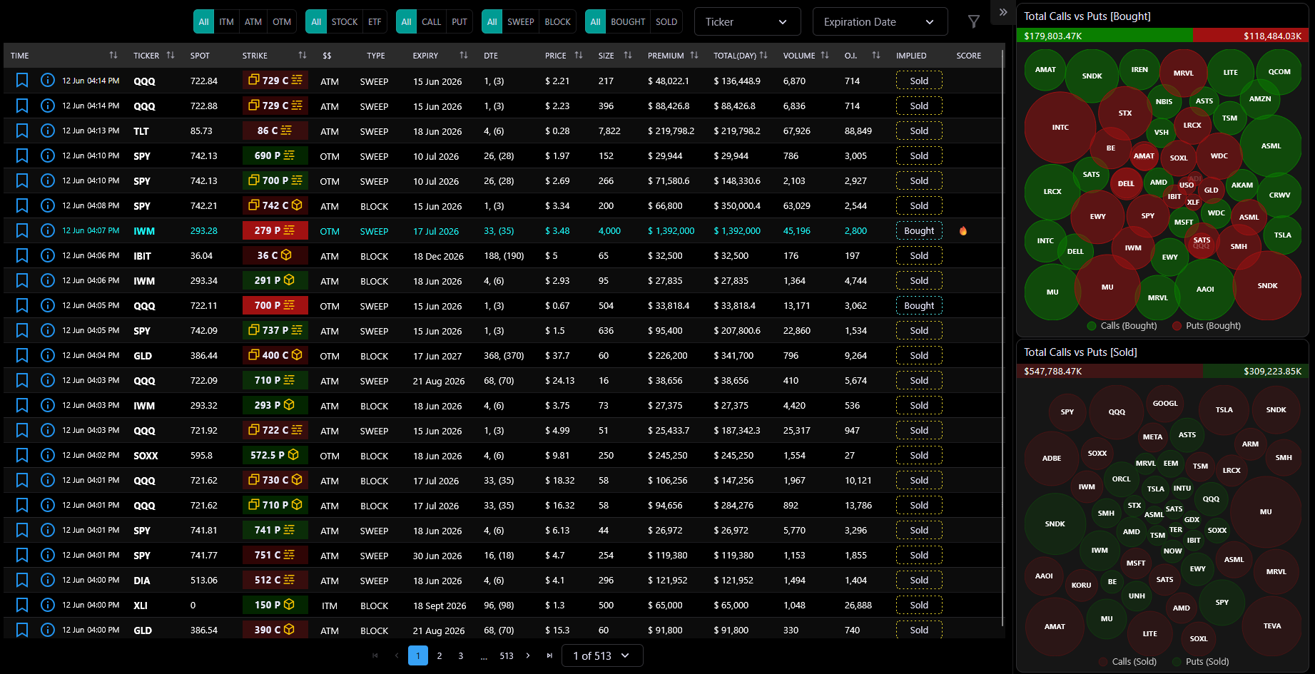
The UOA Flow page is the core feature of JarvisFlow. It provides a real-time, paginated table of Unusual Options Activity — every significant options trade detected across the market.
Each row represents a single options trade and includes the ticker, strike price, expiration date, premium, volume, open interest, and whether it was a sweep or block execution.
Alongside the table, a bubble chart sidebar visualizes the top tickers by premium for both Bought and Sold activity, giving you an at-a-glance view of where smart money is flowing.
The page auto-refreshes every 10 seconds when the server signals new data, and all data is server-paginated — meaning you're always looking at the most current information without reloading the page.
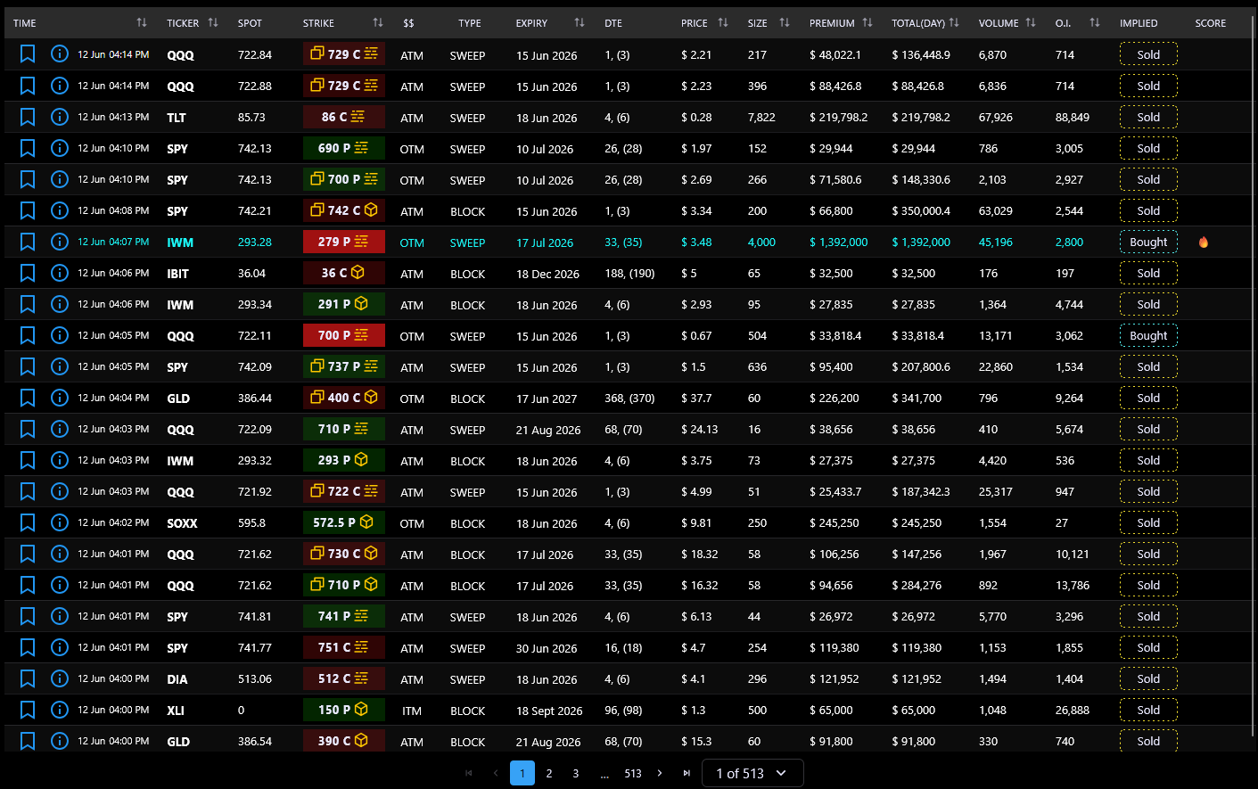
The desktop table displays 15 columns:
Time — When the trade occurred. Click the info icon to open the full detail view.
Ticker — The stock or ETF symbol. Click any ticker to filter the entire table to that symbol. High-activity flows (over $1M today) are highlighted in cyan.
Spot — Current market price of the underlying stock.
Strike — The option's strike price, color-coded by trade type: green (call bought), teal (call sold), red (put bought), yellow (put sold). Also shows sweep/block/repeat icons.
$$ — Moneyness: ITM (In The Money), ATM (At The Money), or OTM (Out of The Money). Click to filter by that moneyness.
Type — Trade execution type: BLOCK, SWEEP, or --- (standard).
Expiry — The option's expiration date. Click to filter by that date.
DTE — Days to Expiration.
Price — The option's last traded price.
Size — Number of contracts traded.
Premium — Total dollar value of the trade (price × size × 100).
Total (day) — Cumulative premium for that ticker on the same day.
Volume — Total contracts traded today.
O.I. — Open Interest (outstanding contracts).
Implied — Direction indicator: Bought (aggressive buyer) or Sold (aggressive seller).
Score — Algorithmic conviction score for the trade.
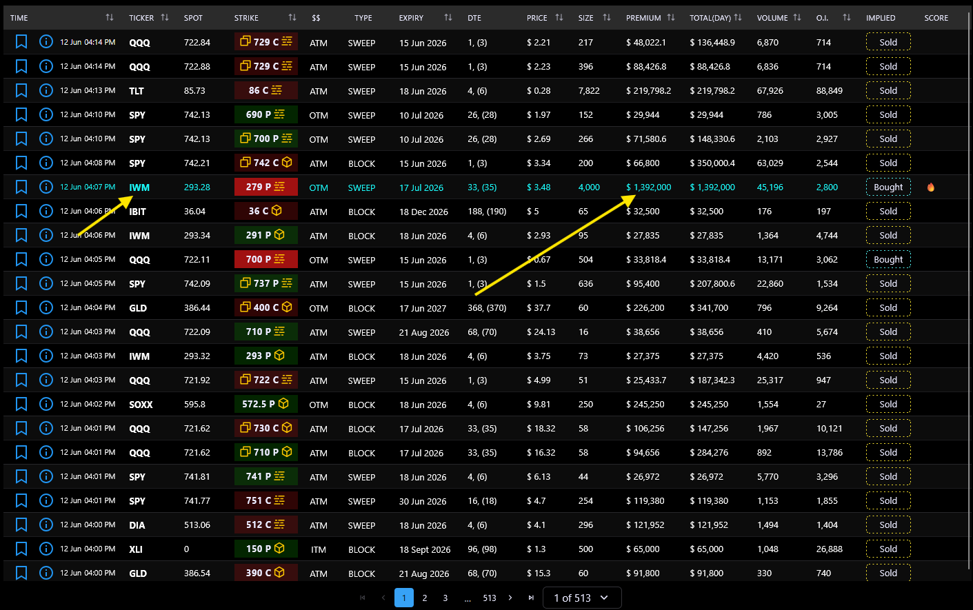
The table uses color and icon conventions to help you quickly identify trade characteristics:
Strike badge colors:
Cell highlight colors:
Trade type icons (next to strike):
Implied direction badge:
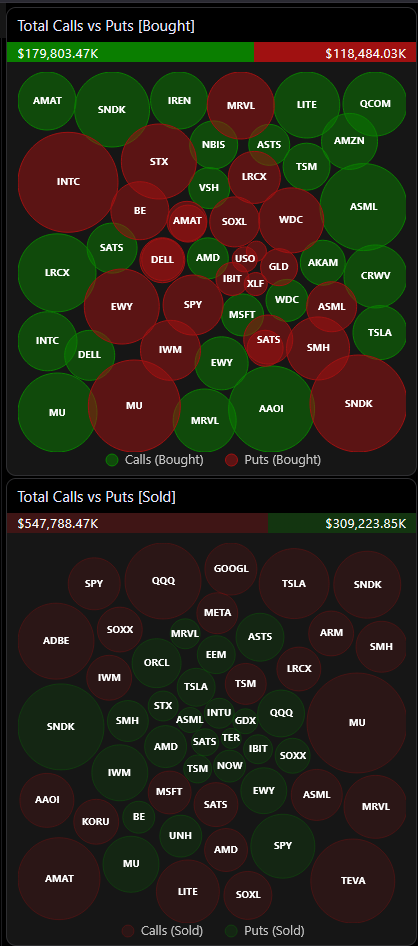
The bubble chart sidebar sits to the right of the flow table (on desktop) and provides two visual summaries:
Top chart: Total Calls vs Puts [Bought]
Bottom chart: Total Calls vs Puts [Sold]
Each bubble represents a ticker and its size is proportional to the total premium traded. Larger bubbles = more money flowing through that ticker's options.
A gradient bar above each chart shows the call/put premium ratio at a glance.
Interactive features:

The Flow page provides a comprehensive set of filters to narrow down the data:
Inline filters (desktop top bar):
Advanced filters (drawer, click the filter icon):
All filters update the table and charts in real time. You can combine as many filters as needed.
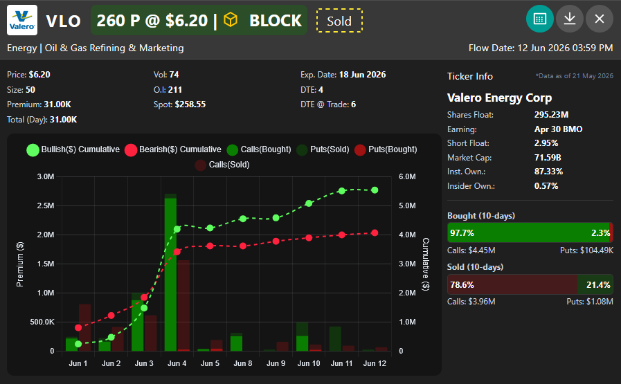
Clicking the info icon on any row opens a FlowInfoCard modal with a comprehensive breakdown of that trade:
Header: Company logo, ticker symbol, strike price, call/put badge, trade type icon, bought/sold indicator, and conviction score.
Metrics grid: Price, Volume, Expiration Date, Size, Open Interest, DTE, Premium, Spot Price, Trade DTE, and Total (Day).
Time-series chart: Shows the last 10 trading days of options activity for that ticker. Toggle between:
Ticker info panel: Company name, Shares Float, Earnings Date, Short Float %, Market Cap, Institutional Ownership %, and Insider Ownership %.
Export: Copy to clipboard or download as PNG image.

The detail modal's time-series chart offers two visualization modes:
Simple mode: Shows two bars per day — Calls and Puts — making it easy to see the raw split of call vs put activity over the last 10 trading days.
Advanced mode: Separates the data into directional flows:
Advanced mode is useful for identifying which side is building a position over multiple days, rather than just seeing raw call/put volume.
Both modes also show a bought/sold indicator bar below the chart, displaying the proportional split for the charted period.
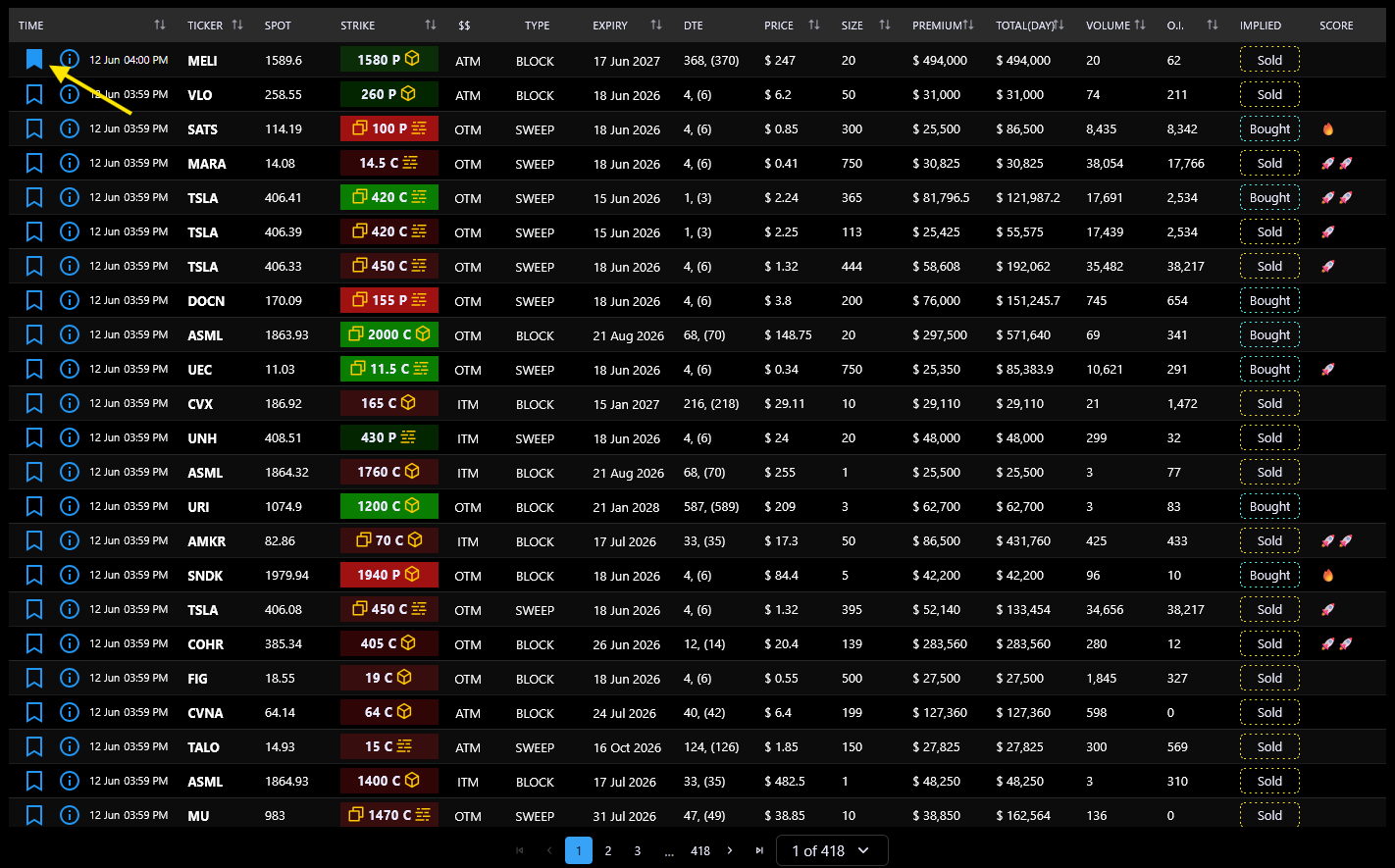
Each row in the flow table has a bookmark icon. Click it to save a flow to your personal collection.
How it works:
Bookmarks are synced to the server and persist across sessions. They're useful for tracking trades you want to revisit, building a watchlist of interesting activity, or marking trades for further analysis in the Chat page.
The Flow page automatically refreshes when the server signals that new data is available.
How it works:
Refresh flag with each response. When true, the client starts auto-refreshing.All refresh requests are silent — no error toasts appear for transient failures. The table and charts update seamlessly when new data arrives.
The page also supports server-side pagination — you can navigate between pages without losing your filter state.
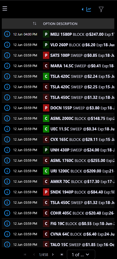
On tablets and phones, the Flow page automatically switches to a compact 3-column layout that's easier to read on narrow screens:
Column 1: Time — Info icon + date (if multi-day range) + time.
Column 2: Option Description — A single rich cell combining: call/put color badge, ticker (clickable to filter), strike price, activity type, price, expiration date, DTE, conviction icon, repeat indicator, and total premium for the day. All key information in one compact cell.
Column 3: Implied — Bought or Sold badge.
You can toggle between Mobile Optimized View and the full desktop layout using the switch in the filter drawer (labeled "Mobile Optimized View"). On smaller screens, the bubble chart sidebar collapses into a drawer accessible from the table header.
The filter controls also adapt — on mobile, all filters live inside the drawer rather than inline.
JarvisFlow is a financial trading analytics platform built for retail traders who want institutional-grade options flow data, AI-powered analysis, and real-time market intelligence.
The platform provides:
JarvisFlow is designed to help you discover unusual activity, understand market sentiment, and make more informed trading decisions.
After logging in, here's a recommended workflow:
Each page has its own FAQ section accessible from the FAQ page.
Navigate to the Settings page from the sidebar. You'll find three sections:
Profile — View and edit your name, email, role, and account status. You can also update your password from here.
Discord — Connect your Discord account to join the JarvisFlow community server. The connection process uses Discord OAuth and requires two steps: joining the server first, then linking your account.
Billing — View your subscription details, check payment status, and manage your subscription.
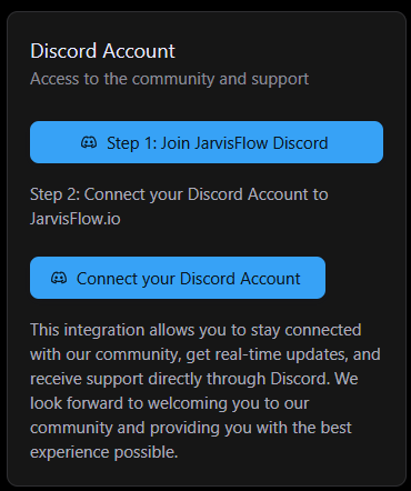
Connecting your Discord account gives you access to the JarvisFlow community server.
Steps:
Once connected, you'll see a green indicator and a direct button to open the Discord server.
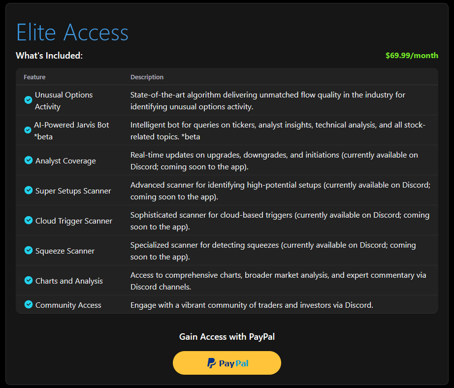
JarvisFlow offers an Elite Access subscription that unlocks all platform features including:
To subscribe:
Free-tier users are automatically redirected to the Purchase page on login.
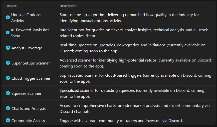
The Elite Access subscription provides full access to every feature on the platform:
Free-tier users see a limited subset of these features and are prompted to upgrade.
JarvisFlow currently accepts payments through PayPal. This includes:
All payments are processed securely through PayPal's payment infrastructure. JarvisFlow does not store your payment details — they are handled entirely by PayPal.
Whop is also supported as an alternative payment provider for users who prefer it.
You can cancel your subscription at any time from either the Purchase page or the Settings page (Billing tab).
Steps:
For Whop subscribers, you can also manage your subscription directly on the Whop platform.
Navigate to Settings → Billing to see your current subscription details:
If your last payment failed, you'll see a warning with a recommendation to re-subscribe.
The Chat Page allows you to interact directly with JarvisFlow AI, an intelligent assistant designed to help you analyze market activity, interpret data, and explore trading ideas.
This page is ideal for users who want quick insights, structured analysis, or deeper explanations without manually filtering through tables and charts.

You can use the chat input to ask JarvisFlow AI questions about:
Simply type your question and submit it to receive a detailed response.
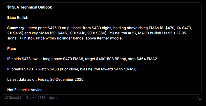
After you submit a prompt, JarvisFlow AI generates a structured analysis report that typically includes:
Bias — A directional outlook (bullish, bearish, or neutral) based on current market data and technical indicators.
Summary — A concise overview of recent price action including key support/resistance levels, moving averages, momentum indicators (RSI, MACD), and volatility indicators (Bollinger Bands, Keltner Channels).
Plan — A scenario-based breakdown of potential outcomes with conditions that support trend continuation, key levels to watch, and alternative scenarios if price breaks important levels.
Each response includes a timestamp showing when the data was last updated and a disclaimer that information provided is not financial advice.
The Chat Page works best when combined with the rest of the platform:
This creates a seamless workflow from data discovery to interpretation.
Unusual options activity (UOA) refers to options trades that are abnormally large compared to the average daily volume for a given contract. These trades often signal that institutional traders or "smart money" are taking significant positions, which can indicate expected price movement in the underlying stock.
JarvisFlow processes hundreds of thousands of options trades daily using proprietary algorithms. We analyze trade size relative to average volume, premium spent, bid/ask positioning, and historical patterns to identify high-conviction trades from institutional players. Each trade is scored and categorized so you can quickly spot the most significant activity.
JarvisFlow combines real-time unusual options activity detection with AI-powered analysis, an interactive heatmap, and proprietary scanners — all in one platform. Our confidence scoring system filters out noise and surfaces only high-conviction alerts. Plus, our Discord community of traders provides a collaborative edge you won't find elsewhere.
The UOA Flow table is JarvisFlow's core feature — a real-time stream of unusual options activity with 15 data columns including ticker, strike, expiry, premium, trade type, and algo score. It auto-refreshes every 10 seconds and is color-coded by trade type for quick visual scanning.
Colors in the flow table indicate trade direction and type. Green represents bullish activity (calls bought or puts sold), red represents bearish activity (puts bought or calls sold), and other colors indicate sweep trades, block trades, or split executions. The color coding lets you instantly assess the sentiment of each trade.
The JarvisFlow heatmap is an interactive treemap visualization that shows bullish vs bearish money flow across the market. You can drill down through three levels: Sector → Ticker → Strike/Expiration breakdown. The size of each block represents volume, and the color represents net bullish or bearish sentiment.
JarvisFlow offers three proprietary scanners: Super Setups (identifies high-probability options setups based on unusual activity patterns), Squeeze Scanner (detects stocks with conditions ripe for short/gamma squeezes), and Cloud Trigger Scanner (finds tickers breaking through Ichimoku cloud levels with supporting options flow).
JarvisFlow does not currently offer a free tier. We focus on providing premium, institutional-grade analytics that deliver real value to serious traders. You can subscribe to Elite Access and cancel anytime if it doesn't meet your needs.
No. JarvisFlow AI and all platform features are intended to assist with research and education only.
All outputs are generated based on available data and technical models and should be used as a supplement to your own analysis and judgment.
The information provided is not financial advice. Always conduct your own research and consult with a qualified financial advisor before making investment decisions.
Join our Discord community or reach out to our support team for personalized assistance