
Browse frequently asked questions about Heatmap
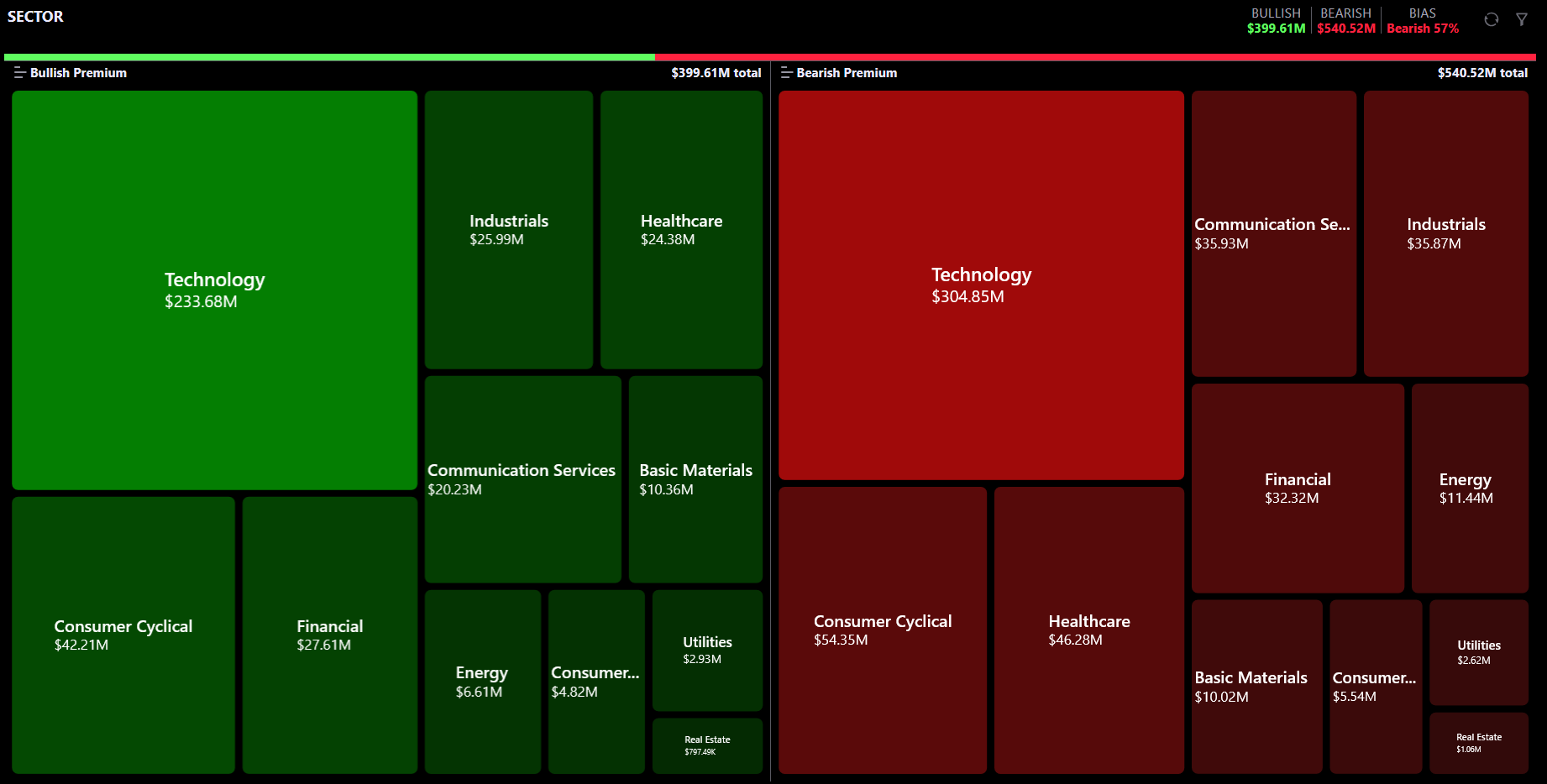
The Heatmap is an advanced visual exploration tool for options money flow on stocks. It uses an interactive treemap where each tile represents a stock (or group of stocks) and its size reflects the total premium traded.
Key differences from the Dashboard:
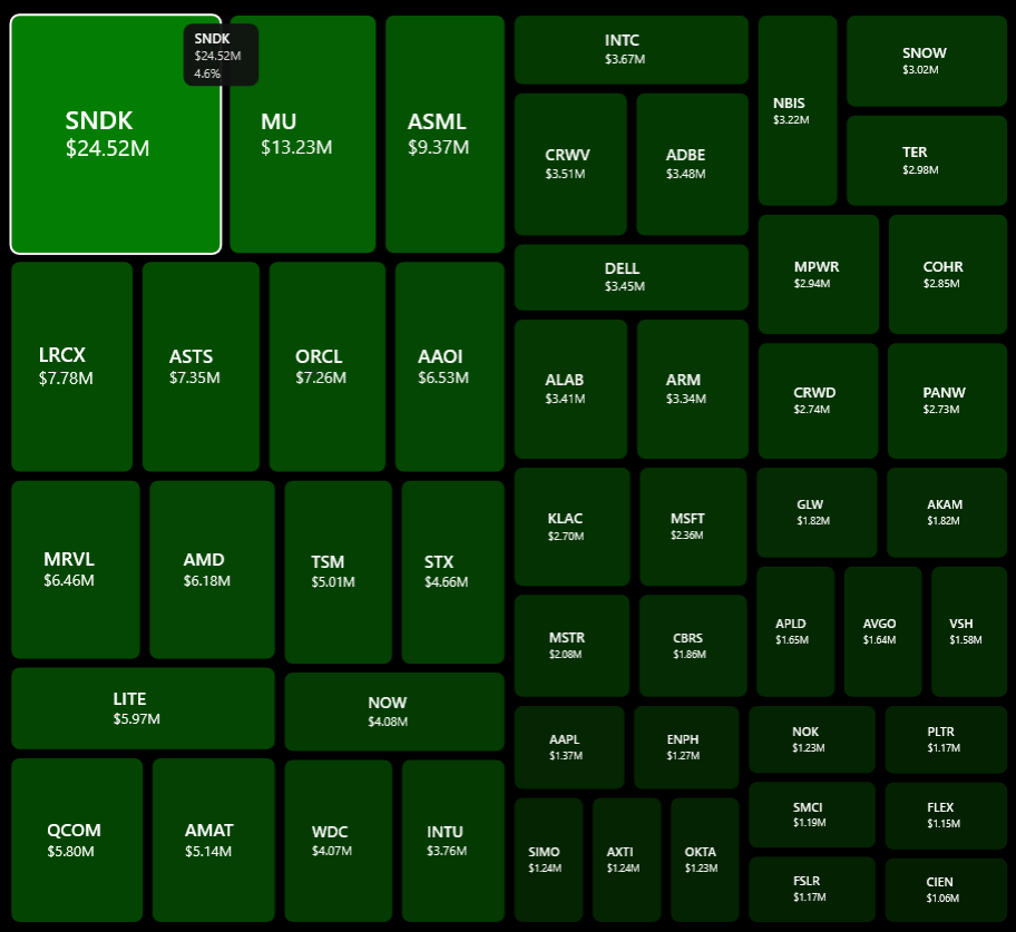
Each tile in the treemap represents a stock, sector, or industry depending on your current drill level.
Tile sizing: Tile area is proportional to the total premium traded. Larger tiles = more options activity.
Tile colors:
Tile labels: Each tile shows its name and the dollar premium amount (e.g., "NVDA $12.5M").
Hover: Hovering over a tile shows a tooltip with the ticker name, premium amount, and its share of the total flow.
Click: Clicking a tile drills down to the next level of detail.
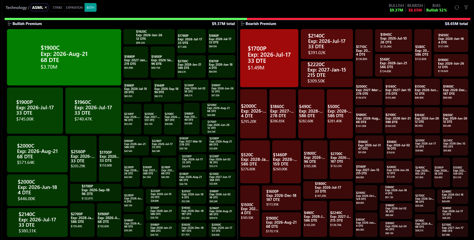
The Heatmap supports 3 levels of drill-down:
Level 1 (Top): All Sectors or All Industries — the top-level treemap tiles.
Level 2: Click a sector or industry tile → the treemap updates to show individual stock tickers within that group.
Level 3: Click a specific ticker → the treemap breaks down that ticker's flow by Strike Price, Expiration Date, or Both.
Navigation: A breadcrumb appears above the treemap showing your current path (e.g., "Sectors > Technology > NVDA"). You can:
You can also use the Sector/Industry/Ticker dropdowns in the filter drawer to jump directly to any level without clicking through.

The top row displays three key metrics:
Bullish Premium — Total dollar amount of bullish options flow (calls bought + puts sold).
Bearish Premium — Total dollar amount of bearish options flow (puts bought + calls sold).
Bias — The dominant sentiment as a percentage. Examples:
Below these stats, a gradient bar visually shows the bullish-vs-bearish split: the green portion represents bullish flow and the red portion represents bearish flow, with dollar amounts on each end.
Use the Sector / Industry toggle at the top of the Heatmap:
Switching the toggle resets the drill-down to the top level and re-fetches data. You can also select a specific sector or industry directly from the filter drawer dropdowns.
The Heatmap supports both Stocks and ETFs. Switch between them using the Instrument Type toggle in the filter drawer (STOCK / ETF).
When in ETF mode:
When switching from ETF back to Stock mode, the drill-down resets to the top level.
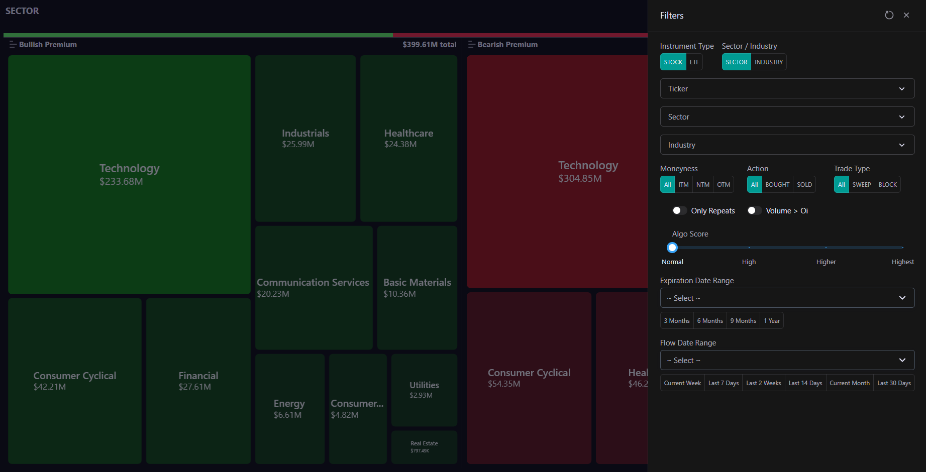
The filter drawer (opened via the filter icon) provides the same power as the Flow page:
Quick Filters (top row):
Dropdown Filters:
Option Filters:
Toggles:
Sliders & Ranges:
Use Reset to clear all filters and return to the default view.
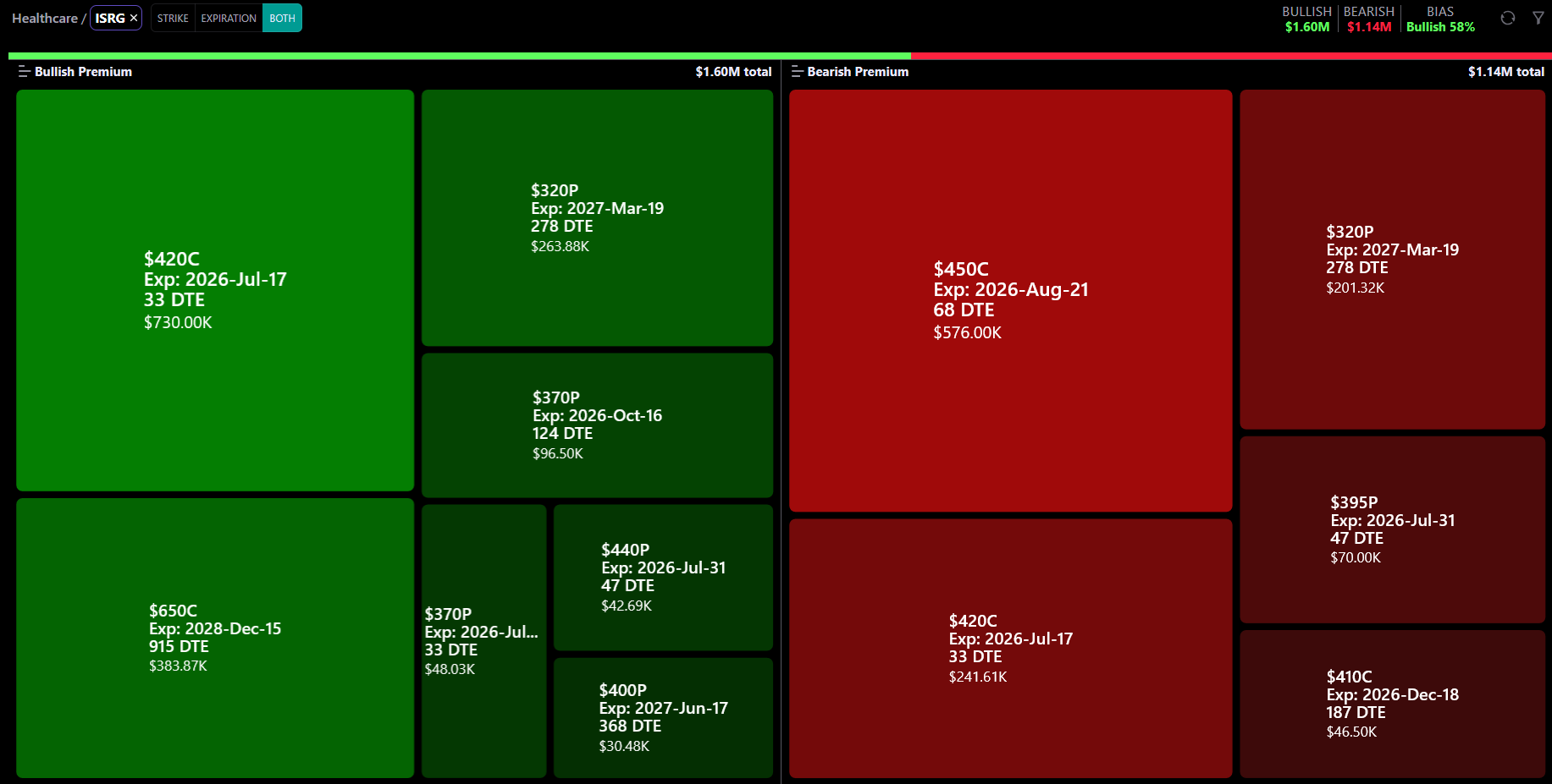
When you drill down to a specific ticker (Level 3), a secondary toggle appears next to the ticker name in the breadcrumb:
The default is Both when you first reach Level 3. Changing this toggle re-fetches the data for the current ticker without leaving the drill-down view.
Tile size reflects the total premium (dollar value) of options flow for that stock or group.
Larger tiles = more money flowing through that stock's options. Smaller tiles = less activity.
Tile sizes are calculated relative to the global total (both bullish + bearish combined), so a tile with $100M premium is visibly larger than one with $25M, regardless of which pane (bullish or bearish) it appears in.
On mobile, fewer tiles are shown (20 instead of 50) to keep them large enough for readable labels.
When you hover over any tile, a tooltip appears showing:
On mobile, tap a tile to see the tooltip briefly before the drill-down action triggers.

The breadcrumb above the treemap shows your current position:
To go back:
You can also use the Sector / Industry / Ticker dropdowns in the filter drawer to jump to any level directly.
Join our Discord community or reach out to our support team for personalized assistance